The Android app for the Indian market however, could use some improvement.
Follow along as we discuss and solve some key problems and revamp the user interface for a much better user experience.
Disclaimer: This project reflects my personal work and was developed independently of any professional association with OLX.
Rewinding to the start…
How it all began
I came across OLX as I was searching for a way to sell my old furniture during my house renovation. My furniture was well maintained and in fairly good condition and I wanted it to have a second home instead of just discarding it away.
I figured a second-hand goods selling platform would be a wise choice enabling me to give away my products to a like-minded genuine buyer while also making some short money from the exchange.
Afterall, we all know the famous proverb:
One man’s trash is another man’s treasure
However, as I navigated the OLX app on my Android phone, I encountered several frustrating issues—confusing workflows, redundant information, irrelevant steps, and an unintuitive interface.
This experience left me wondering:
- How could a platform from such a prominent company overlook basic usability?
- Was I alone in this frustration, or did others feel the same?
- How can I enhance this while preserving most of the app’s content, features, and branding choices?
These questions inspired me to explore a redesign to make the app more user-friendly.
Lets get the ball rolling…

to be noted:
- Most of the app’s core content and features are preserved. This redesign is aimed at improving what is currently already present.
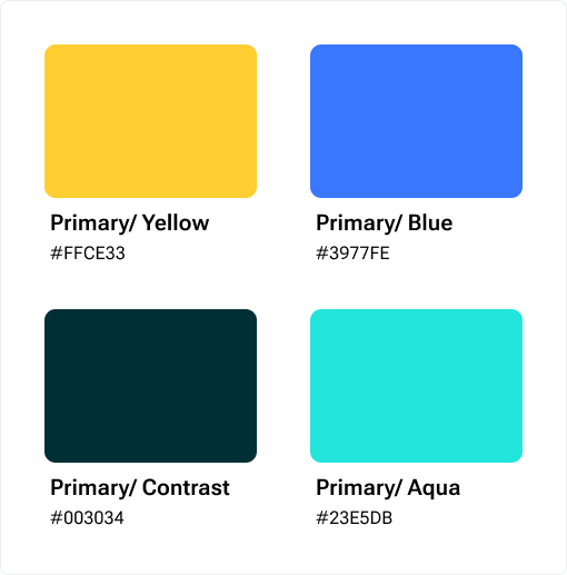
The OLX brand’s primary color palette is retained.

- While the main goal of this redesign is refining the user experience, a new feature has been added to support business objectives —more on this later.
overview:
What went wrong in the current version?
Initial analysis of existing problems and challenges
While a comprehensive audit of the app revealed a lot of issues, following are some of the primary ones with major impact on the UX:
An inconsistent App
OLX’s current design lacked user-centered design principles and patterns, with inconsistent icons, redundant information, poor item categorizations, and inefficient task flows leading to user confusion and reliance on trial and error.
This resulted in decreased user trust and weakened the app’s credibility.
Too many Ads, too little UX
While ads are a key revenue source for OLX, overcrowding the app with them hurts the user experience by making navigation cluttered and slow, distracting users from listings, and increasing accidental Ad clicks causing user frustration.
Is there a better way? Finding the right balance between monetization and usability was key to keeping both users and revenue happy.
Current OLX experience
Unintuitive visual design
A poorly structured UI without proper visual hierarchy, lack of visual cues for navigation and weak microinteractions felt unintuitive and disrupted a logical user flow, making even simple tasks feel difficult.
This led to users struggling to find what they needed and thus a subpar user experience and reduced engagement.
Open Marketplace, Open to Scams?
Anyone who has used OLX knows: You can’t trust everyone.
Apps like OLX, where anyone can buy or sell, are vulnerable to frauds like deceptive scammers, fake listings and advance payment scams. It is imperative to find a system that helps filter out scammers, making interactions safer and more trustworthy for genuine users —something OLX currently seems to be struggling with.
Am I alone in this? Or do others feel the same?
Research – Understanding the users
Besides my personal experience using the app, I conducted research to know if other users faced similar challenges and to understand their needs, pain points and motivations better.
But first, who are the users?
The potential users of the app can be categorized into 2 buckets:
- Buyers
People using the app to buy a product or service - Sellers
People using the app to sell their products to potential buyers
A buyer can also be a seller and vice-versa. However depending on the role they play at a time, each type of user may have different needs and motivations, and possibly different pain points as well.
To understand further, I conducted the research in two phases:
- Secondary Research
(App user reviews, Community forums like Reddit, Complaints on social platforms like X, Competitor Analysis) - Primary Research
(User survey and User interviews)
Secondary Research
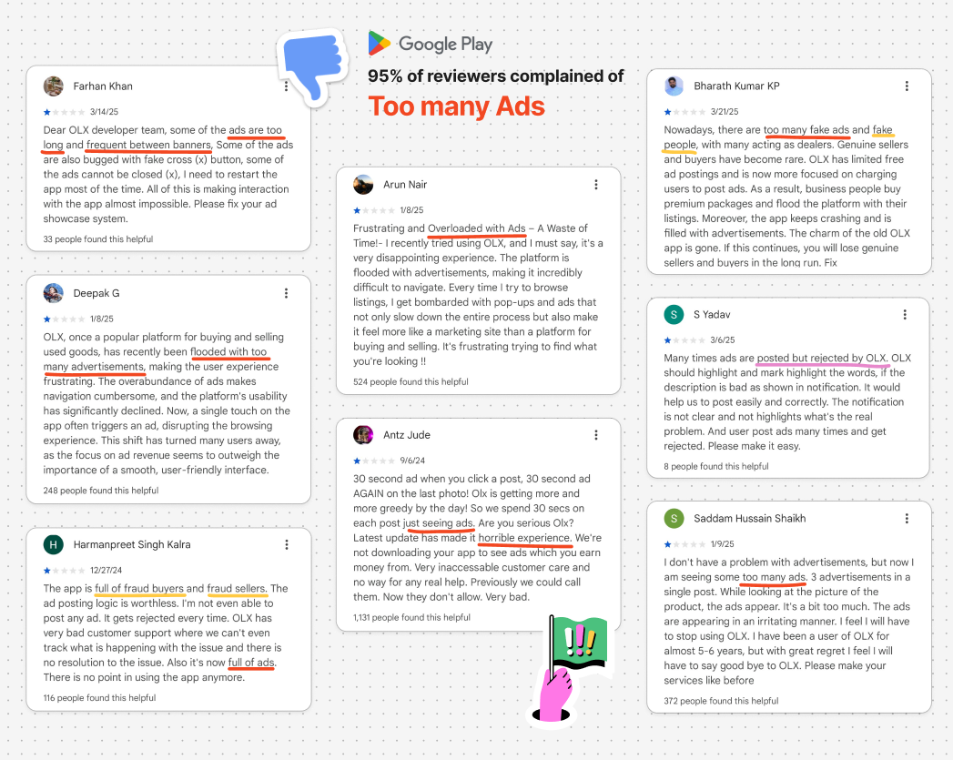
App reviews on Play Store
Views on community forums and social media platforms : Reddit, X (formerly known as Twitter)
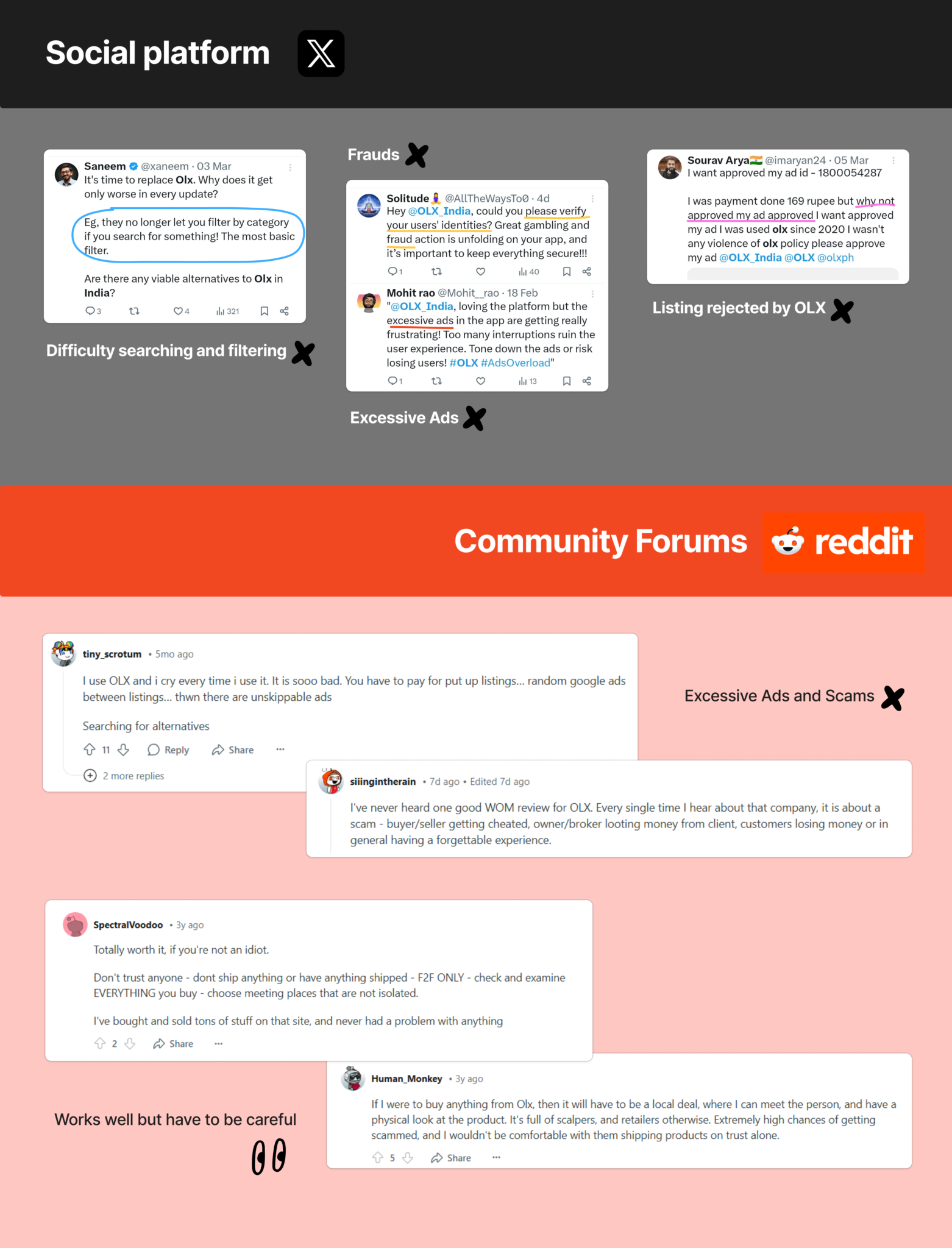
Reading through the user reviews of the app on the Play Store, social platforms (like X) and community forums (like Reddit) confirmed my initial assumptions and furthermore brought into light the following concerns:
Major concern:
Too many ads across the app making it unusable.
Other concerns:
- Fake listings and user profiles
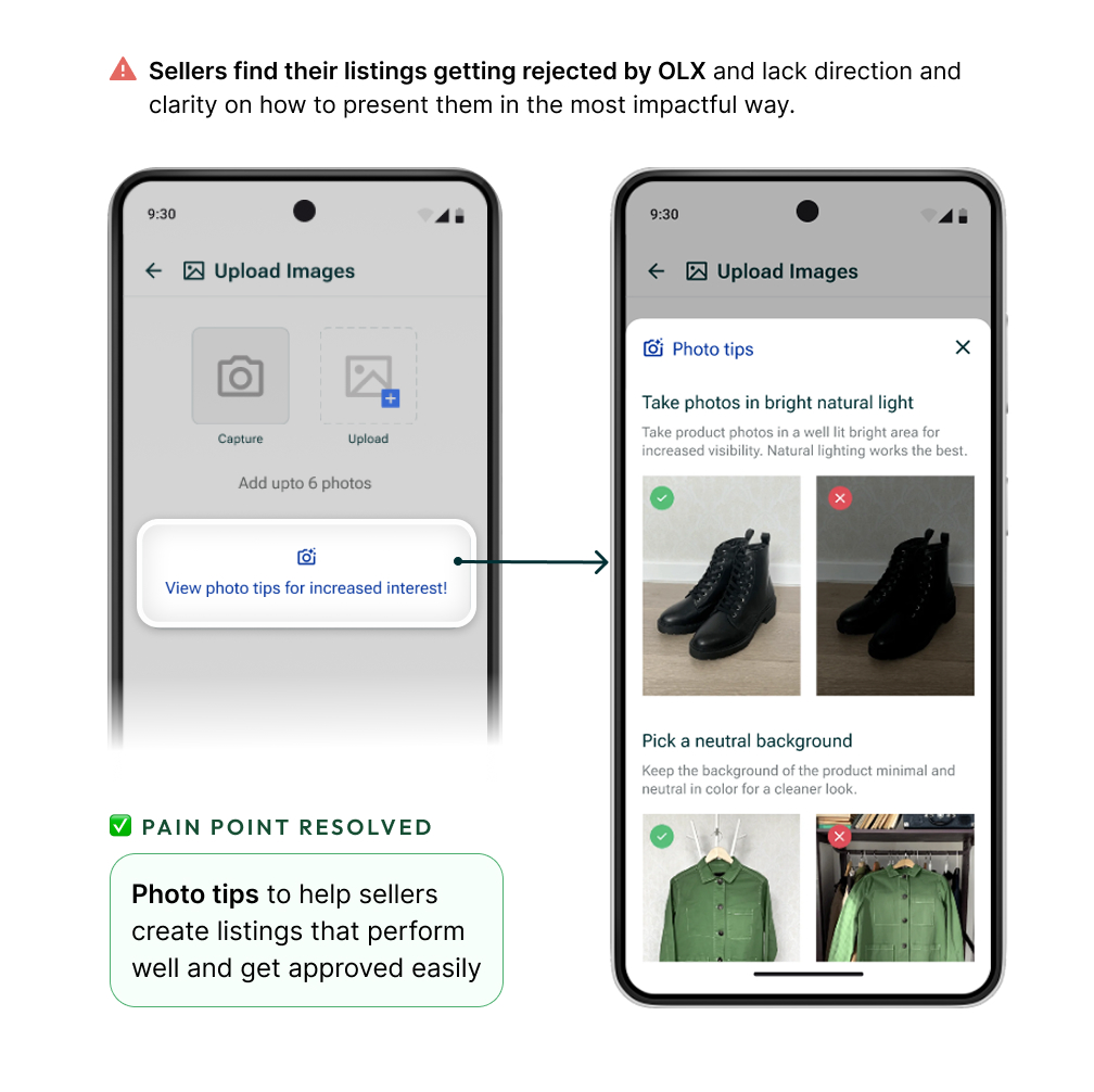
- Difficulty posting listings and high possibility of them getting rejected by OLX causing frustration
- Confusing UI and search flows
- Unclear notifications and chat alerts
Primary Research
I engaged with users of the OLX app through surveys and personal interviews and asked them about their experience using the app.
User survey
- Method: Google Form
- Total no. of responses: 27
User interviews
- Method: Via Zoom calls, and 1:1 in person
- Total no. of responses: 5
Buyers: 3 , Sellers: 2
User survey and interviews objectives:
- What are the primary pain-points that the user (buyer and seller) faces?
- What is your main need and end-goal when using the app?
- How much time does the user spend on the app? Is the app engaging enough?
- Does the app navigation seem easy and intuitive?
- Is the user willing to pay a subscription fee for a better premium version of this app?
- What are the scopes for improvement?
Key takeaways from the users:
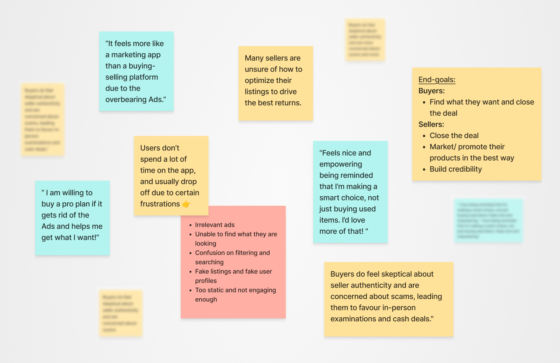
Users feel the app prioritizes ads over its core purpose of buying and selling, making it feel needlessly promotional rather than a genuine marketplace.
Some users feel a sense of stigma when buying second-hand and would feel more confident if the app emphasized value and sustainability while highlighting it as a smart financial choice.
78% users are open to the idea of paying for an Ad-free premium version if it helps them save time, effort, is reasonably priced and gets them what they want.
Users find it confusing to search and filter out categories, and feel the experience is not as intuitive as it should be.
Sellers feel a lack of direction and clarity in creating listings that would perform well.
The app lacks engagement hooks and users don’t see the app as a daily or frequent-use platform, resulting in low retention and engagement.
🤔 interesting user insight
Buyers’ fear of fraud and concerns about seller credibility make them eventually complete transactions offline, opting for in-person inspections and cash payments—ultimately shifting dealings off the app.
80% users said the UI of the app was “okay” but can be improved and said they noticed the inconsistencies.
How are others doing it?
Competitor Analysis
I decided to study and understand how competitors in similar and relevant industries were tackling such issues and aimed to recognize user behaviour better. I reviewed Quikr and Facebook groups.
Furthermore, I decided to focus on popular apps with features useful for our use case, as well as Mobbin to draw inspiration from. Some of the apps I reviewed were Meesho, Flipkart, Zomato, Swiggy, Nykaa, Snapchat and Instagram.
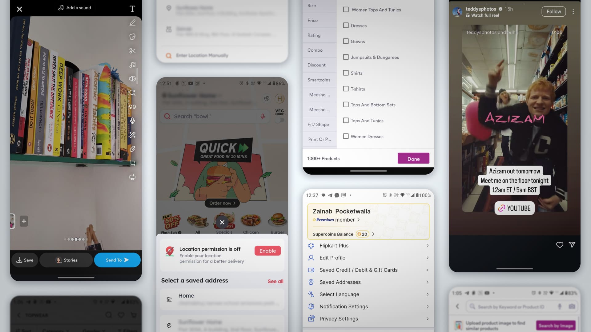
Key insights:
- Quikr’s added services like doorstep delivery and deeper involvement in transactions promise convenience, but its unreliable customer support is known to fail users when issues arise, breaking trust in the platform’s promises.
- While Facebook groups may work to some extent, they mix personal content with selling, making the experience feel distracting and cluttered. They lack the focused structure and intent of OLX which offers a goal-driven dedicated space with serious buyers/sellers.
- Most popular apps use Jakob’s Law to design a similar intuitive structure for common tasks; like sorting and filtering.
Jakob’s Law
🧠 ux law
Users prefer your product to work the same way as others they already know. Using familiar design patterns reduces the learning curve and improves usability.
- OLX has an edge over competition because it is an established legacy marketplace with large volume of buyers and sellers compared to others.
Based on the insights from user research and understanding of similar apps, I started making decisions to address the concerns and work on the areas of improvement.
Introducing a revamped OLX!
Solutions and final outcome
Let’s start our journey from the beginning..
The Onboarding
Onboarding is a crucial step of the app UX. It is the first experience a user has when they open an app, and can make or break the app’s first impressions.
I decided to design a step-by-step onboarding process that introduces users into the app smoothly and helps build trust from the start.
I also realized that the onboarding journey is a key touch point to craft a personalized experience and collect the necessary user data, especially for verification purposes.
I designed the onboarding journey for 3 use cases of entering the app:
- Guest login if the user decides to Skip the onboarding.
(Gives user control by allowing limited access to the app like a freemium model) - Sign up and create a new account
(For new users) - Log-in if account already exists
(For existing users)
Guest login experience
- A ‘close’ button on the Onboarding screen allows users to skip the process and get limited access to the app as a guest.
- User get to have a peak of the app and explore some features before committing to signing up.
- The Onboarding screen is pushed to the user at multiple touch points to encourage signing up. Any feature related to personal activity/information is blocked behind the Onboarding screen.
This approach gives users a sense of control instead of forcing them to sign up from the get go.
Freemium guest user experience
New user onboarding
New user -> Sign up -> Create account
- After verifying the phone number if no existing account is found, the app seamlessly transitions into the new user registration flow, maintaining continuity and guiding users intuitively.
- This process is streamlined into 4 clear steps:
- Register with your email and password.
- Fill in your basic info to create an account.
- Complete your profile with personalized details.
- Verify yourself for better security.
- Additionally, a ‘Continue with Google‘ option offers faster access by auto-filling relevant details from the linked Google account. It also adds an extra layer of security through account verification.
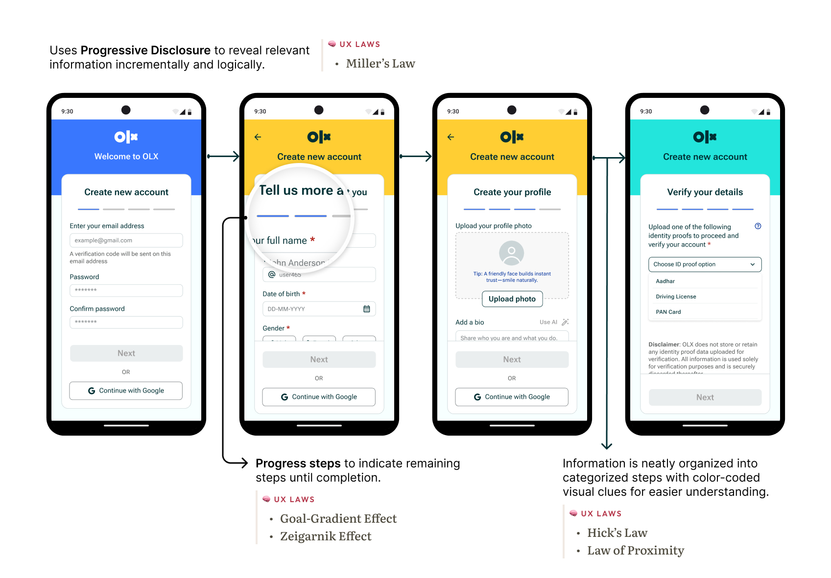
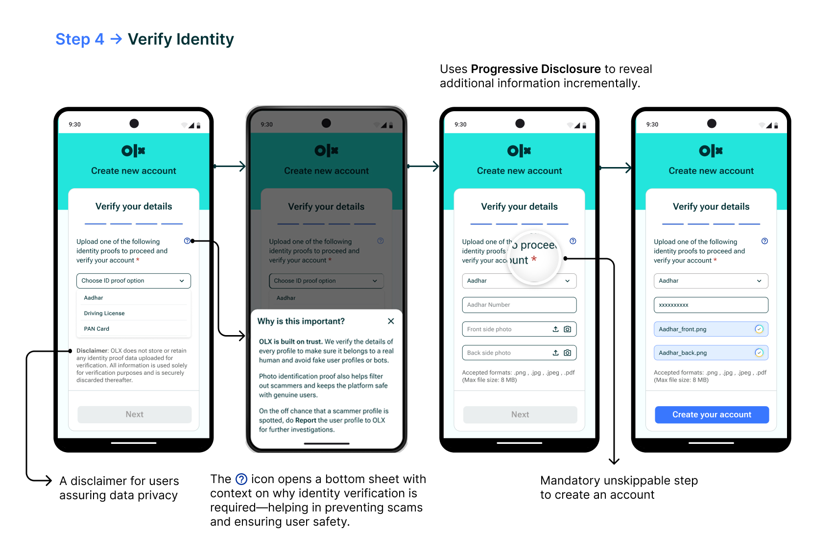
User Identity verification – Stage 4
Pain point resolved
One of the major pain points for users was the prevalence of fake profiles and inaccurate listings.
Sellers felt frustrated with fraudsters contacting them about their listings and buyers were skeptical about seller authenticity.
In order to tackle this issue, I decided to add a ‘user identity verification’ stage right into the Onboarding process.
This mandatory step requires new users to verify their identity by uploading a government authorized Identity proof which could be cross-checked from the backend with the official records.
This helps eliminate threats of fake accounts (since forging official records is difficult and criminally liable) and helps keep genuine users on the app.
Existing user -> Log in
- After phone verification, if a linked existing account is found then the app prompts for the password and logs the user in with a welcome back message.
- Showing the user’s name and profile picture on the ‘welcome back’ screen reinforces recognition and creates a more personalized experience.
This design flow utilizes Jakob’s Law to keep the Login experience familiar to users and speed up the process intuitively.
Existing user onboarding
Next up, rethinking the app’s Information Architecture (I.A.)
Improving usability meant starting at the root—how content is organized, accessed, and understood. Users shouldn’t have to think about where to go next or what to do. A solid Information Architecture (IA) guides them naturally.
Through my research, it was found that users felt confused and lacked clear direction with the app’s current IA.
Hence, I decided to improve some key points of the app like:
The information hierarchy (layout and components), search flow, sorting and filtering results, account and settings screen, multiple ways to access important features and better visual cues. I also restructured the bottom nav-bar to make it more efficient and intuitively useful for the user.
Information Hierarchy:
The existing home screen design felt cluttered with overbearing Ads, thereby decreasing focus from the actual listings and making them feel underwhelming.
I optimized the Information Architecture and Hierarchy for a smoother and more intuitive experience.
- Content categorization to invite exploration and keep users engaged.
- Quantity of ads reduced, instead making an alternative OLX revenue stream by introducing a new feature —Finds. (more on this ahead)
- Improved navigation by offering multiple ways to access key features (like wishlist, categories etc.), thereby enhancing discoverability and reducing user effort.
Copywriting
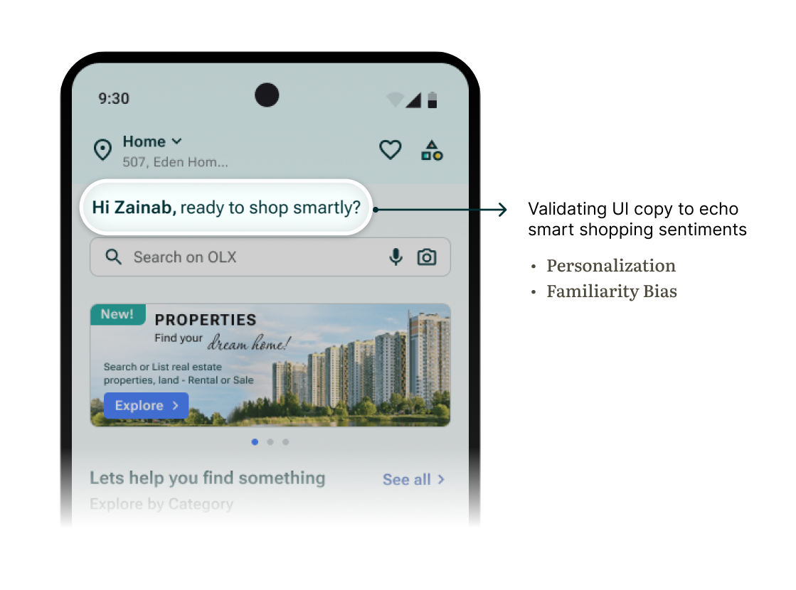
While conducting user research, I found that some users feel a sense of stigma when buying second-hand and would feel more confident if the app emphasized value and sustainability while also calling it a smart financial choice.
Hence I decided to highlight this in the copywriting for the app’s UI text:
Guidance and visual cues:
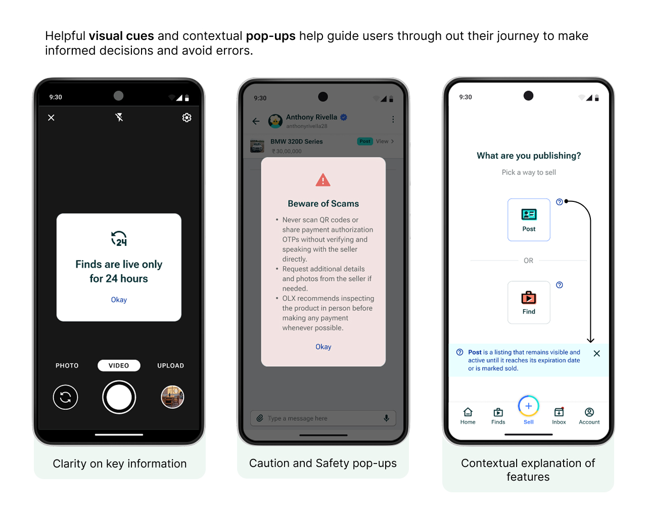
I also incorporated visual cues and contextual prompts to support users and help them navigate tasks with clarity. This helped create a more user-friendly and intuitive experience and prevent errors.
Location access prompt design
OLX relies on accurate location data to serve users with the most relevant and nearby listings. Hence it is imperative that users enable their location access when using the app.
The Before:
- Too easy to ignore and dismiss
- The current design looks small, feels passive and easily dismissible. It feels more like an interruption and less like an essential user input.
- Poor Call-to-Action design
- The CTA lacks prominence and fails to persuade user to take action.
- Can fall prey to Banner Blindness
- Banner blindness is a usability phenomenon where users subconsciously ignore or disregard banners and pop-ups that mimic typical Ad patterns in design or placement.
OLD location access design
The After:
- Bottom-sheet design
- Location prompt opens as a bottom-sheet taking up more visual space and attention.
- Includes a skip option, but still highlights location input as a key step in the journey.
- Jakob’s Law
- The new design leverages Jakob’s Law by keeping the location experience familiar, consistent with patterns users encounter in other apps.
- Clear Call-to-Action with value
- A clear CTA with color coded cues calls out visual attention along with smart copy explaining it’s need.
- Faster access with pre-saved addresses
- Added flexibility by letting users select from saved addresses for those with multiple locations.
NEW location prompt
Introducing — Finds ✨
Short-form discovery meets smart shopping
new feature alert!
Finds is a new full-screen, short-form content feature that I designed for the OLX app, inspired by the familiar swipeable formats of Stories, Reels, and Shorts. It offers users a visually rich, snackable way to explore dynamic listings, promotions, and curated content — reimagining how second-hand discovery happens on a platform like OLX.
I designed Finds as an alternative revenue stream for OLX to downsize the quantity of Ads displayed on the app — which was a major pain-point for most users.

Why ‘Finds’ works for OLX users:
- Visual-first discovery
- Users can browse listings in a highly visual, story-like format that’s faster and more engaging than scrolling traditional feeds.
- Better storytelling for sellers
- Sellers can showcase items in a more dynamic way using quick videos, photos, and even voice — adding context and increasing buyers’ interest.
- Passive exploration → active interest
- Instead of relying on search or manual scrolling alone, Finds enables passive discovery — ideal for users who aren’t looking for something specific but are open to inspiration or deals.
- Higher emotional engagement
- The immersive format helps users connect and engage deeper on an emotional level.
- Gives a fresh take to listings making them more captivating.
Finds – new feature
How it helps OLX — benefits for the app:
- Better engagement and user retention
- By making content more dynamic and continuous, Finds keeps users engaged longer increasing session time, and encouraging repeat visits, boosting both time spent and retention.
- Improved product discovery
- Especially for newly listed or underexposed items, Finds boosts visibility without relying solely on search ranking.
- Personalized content loop
- With engagement signals (swipes, taps, shares), OLX can improve recommendation algorithms and personalize the browsing experience.
- New creative surface
- Finds becomes a fresh UX surface for showcasing campaigns, new features, or tips and guides — without disrupting core flows.

Revenue opportunities from ‘Finds’ :
- Sponsored stories / paid boosts
- Sellers can pay to promote their listings as top ‘Finds’ placements — boosting visibility in a high-attention zone.
- Branded content formats
- Scope for businesses to create sponsored mini-reels for product showcases, flash sales, or service promotions.
- Ad slots between stories
- A better space for ads. Finds creates opportunity for ads to be inserted between user-generated content, just like in Instagram Reels or YouTube Shorts.
- Future expansion with affiliate partnerships
- OLX can collaborate with third-party brands to surface complementary services (e.g. delivery, insurance, cleaning) as sponsored Finds.
- Scope for creator community
- In the future, verified sellers or micro-influencers could earn from creating high-performing content — incentivizing high-quality listing creation.

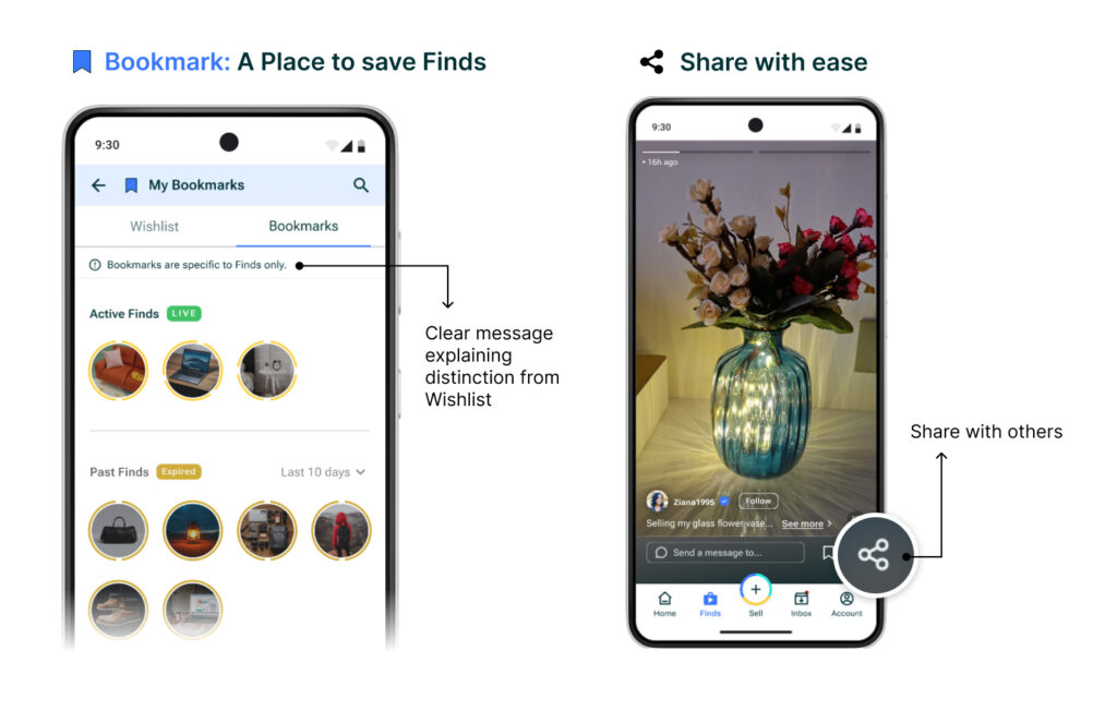
Save Finds for later as ‘Bookmarks’ + share!
Found a Find interesting and want to save it for later?
That’s easy! Finds can be saved for later in a new collection called ‘Bookmarks’ which is separate from ‘Wishlist’.
Finds can also be shared easily with others, even beyond the app, extending visibility and widening the audience scope.
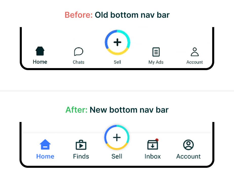
Bottom nav bar, leveled up – Refining navigation
The bottom navigation bar plays a crucial role in how users explore and interact with the OLX app.
As part of the redesign, I restructured the bottom nav bar to better reflect user needs and app priorities. The aim was to improve access to key features, reduce cognitive load, and simplify navigation.
Key improvements:
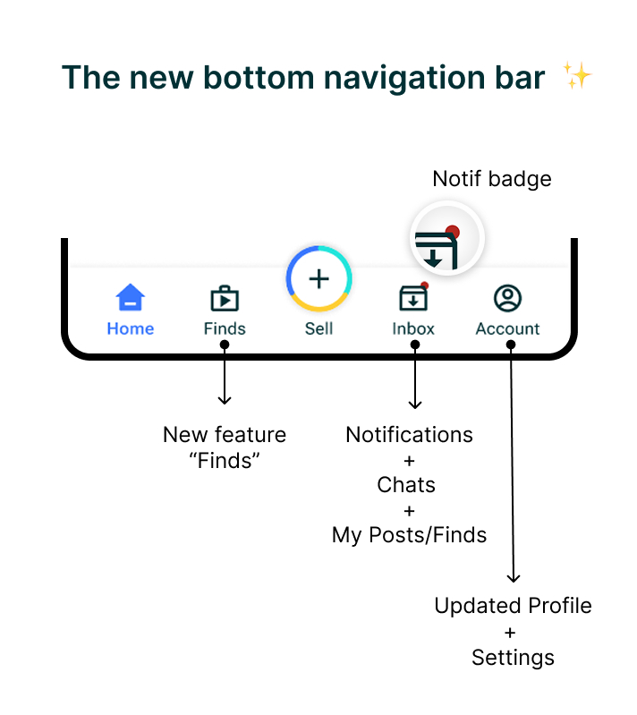
- Added a dedicated ‘Finds’ tab
- Easy access to short-form content feature ‘Finds’ increasing user engagement and time spent on app.
- Improved iconography and labels
- Clearer icons and terminology help users recognize key features instantly and navigate with ease.
- Cleaner tabs with purpose
- “Chats” and “My Ads” were merged into a more actionable “Inbox” tab containing a dedicated space for “Notifications” to streamline communication, alerts and listing management.
- Notification badge and visual cues
- “Inbox” tab displays a notification badge prompting attention and keeping user up-to-date.
- Tab ‘states’ are theme color-coded for instant visual understanding.
- Revamped Account tab
- The “Account” tab now contains User Profile and Settings to keep things organized and maintain relevancy.
The improved Inbox ✨
The previous OLX experience separated ‘Notifications’ and ‘Chats’ (which was masked under “My Ads”), causing confusion with users struggling to find the sections to stay updated. To streamline this interaction, I introduced a unified Inbox tab—bringing together Chats and Notifications under a single, cohesive space.
- Designed for dual roles: Buyer and Seller
- An OLX user can operate in both roles—buying and selling simultaneously.
- The new Inbox now adapts contextually based on user intent. A simple toggle lets users switch between Buyer and Seller modes, instantly reorganizing the view to show only relevant messages and actions.
- Centralized communication and updates
- With Notifications now integrated directly into the Inbox, users no longer miss important updates. This reduces fragmentation and ensures all communication—personal or platform-driven—is housed in one accessible place.
- Quick Links
- In Seller mode, sellers can quickly view and access their uploads through Quick Links to “My Posts” and “My Finds”. This supports a faster workflow for managing listings and viewing context.
- In contrast, Buyers primarily browse and interact with listings and do not upload content—so these shortcuts are intentionally omitted to reduce visual noise and maintain focus.
- Enhanced usability features
- A search bar allows users to quickly locate specific chats.
- Favorites help users star high-priority conversations.
- Visual hierarchy clearly separates messages, actions, and system feedback.
- Subtle visual cues (icons, timestamps, read indicators) improve scannability and clarity.
New Inbox designed for ease
✅ Why it works
This new Inbox design is not just visually cleaner—it’s functionally smarter. It respects the dual nature of OLX’s user base, simplifies and organizes the UI by merging related content, and introduces clearer entry points to relevant tasks. As a result, users feel more in control, communication feels more organized, and task completion becomes more efficient.
Now, lets look at some flows — thoughtfully redesigned
In the interest of improving users’ journeys and usability, I redesigned several key flows across the OLX app. These include everyday actions like searching, filtering results, and making offers—each reimagined to feel faster, smarter, and more intuitive. The goal was to minimize effort while maximizing clarity and user confidence at every step.
Search flow: From basic to intuitive
The Before:
- Basic manual search input — no alternate input methods like image or audio.
- Minimal assistance for exploratory browsing or unsure users.
- Overall aesthetics feels too minimal.
- Unnecessary requirement to input Location again during search.
OLD Search Flow
NEW Search Flow
The After:
- Search with more input methods like speech-to-text (audio) keeping accessibility in mind.
- Image Upload feature introduced — users can now search using product photos, reducing reliance on exact keywords.
- Location selection option removed to avoid redundancy.
- Smart search suggestions like trending, other categories, and recent searches to invite discovery and make the search experience more engaging.
- Visually more aesthetic and modern, with better spacing, icons, and hierarchy.
- Supports both focused search and casual browsing — catering to more diverse user intents.
- Optimized Sorting and Filtering keeping the experience clean and familiar like in other apps.
Make an offer to a Seller
Making an offer or initiating a chat with a Seller is the primary point of engagement on OLX— from discovery to conversion. During my user research, an interesting user insight caught my attention:
Buyers’ fear of fraud and concerns about seller credibility make them eventually complete transactions offline, opting for in-person inspections and cash payments—ultimately shifting dealings off the app.
Not every “good-to-have” feature translates into real-world value.
I realized that while having a dedicated “Make an offer” flow seemed helpful in theory, user behavior told a different story. I found that most users rarely took this route to pitch an offer, often skipping it entirely and opting to directly chat and take transactions offline due to trust issues. This also mirrored my own experience of dealing on OLX.
Hence, I decided to simply remove it — prioritizing actual user habits over assumed needs and reducing unnecessary options thereby streamlining the overall journey.
OLD ‘Make an offer” flow
NEW ‘Make an offer” flow
After: The new “Make an offer” flow
The updated flow eliminates the unnecessary ‘pitching an offer’ step and prioritizes direct user communication through chat, enabling faster and more natural buyer-seller interactions.
- Contextual pop-ups reminding users of online scams and encouraging detail-oriented conversations are surfaced before initiating chats.
- Suggestion prompts in chat help users initiate conversations more easily, reducing early friction.
- Easy to access and view listing details and seller information to make informed decisions when engaging with a seller.
- Better conversion potential due to low effort quicker interactions between users while keeping privacy intact.
Sell flow: Uploading Posts and Finds by sellers
Uploading a listing is the first primary task for sellers on OLX.
With the introduction of Finds—short-form, 24-hour content—sellers now have two distinct formats to showcase their items: traditional Posts and time-sensitive Finds.
To support both formats, I designed dedicated upload flows that are tailored, intuitive, and streamlined to match the intent behind each type of listing.
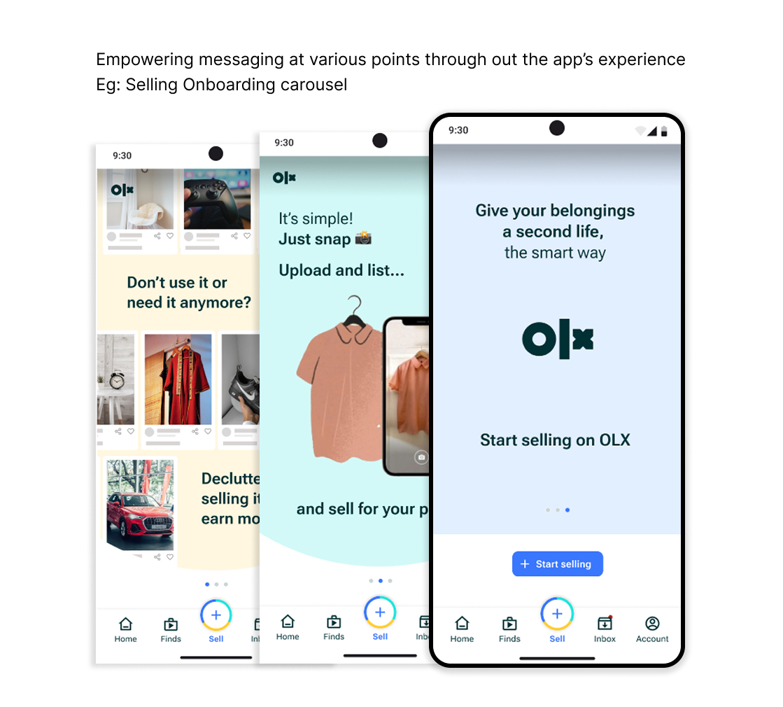
The sell journey begins with an Onboarding full page carousel highlighting it’s benefits and guiding new users onboard the journey. For experienced users, it remains skippable, allowing them to jump straight into the flow.
Post upload flow
Post Upload Flow (Regular Listing)
- Post is a listing that remains visible and active until it reaches its expiration date or is marked sold.
- Step-by-step guidance for category selection, photos, title and description, price, and location, along with a preview in the end.
- Encourages completeness and clarity with helpful tips and placeholders, helping users create listings that perform well in search.
- Clear CTAs and validations ensure the seller doesn’t miss any key details.
- Quoting a price is now much easier! Thanks to the option to see similar listings for a better idea.
- Drafts now let users come back to the upload process seamlessly incase of any interruptions, making it easier and reducing the cognitive load.
Finds Upload Flow (Short-Form Listing)
- Find lets you share photos and videos that last for 24 hours before expiring. Best for time-sensitive promotions.
- Opens directly into camera mode with gallery access, encouraging fast visual sharing.
- Immersive story like format with relevant quick edit features keeps users engaged in real time.
- Fast publishing experience with fewer steps reduces cognitive load and encourages expressive and spontaneous listing behavior.
Find upload flow
A new way to Sort and Filter results
Sorting and filtering are crucial tools to help users narrow down choices and find relevant listings faster. They are vital for goal-oriented users who are searching with intent, not just browsing.
The old experience felt unintuitive with users complaining of inaccurate results and confusion regarding how to effectively filter for the best results.
From insights realized through competitor analysis and inspiration from UX laws, I redesigned the flow to make it much easier and intuitive.
The Before:
- A non-standard sort and filter UI disrupted familiar mental models, adding unnecessary friction to the user’s flow for a low effort activity.
- Insufficient and generic filters offered little control or refinement.
OLD Sort and Filter
NEW Sort and Filter
The After:
- The updated Sort and Filter flow leverages Jakob’s Law to keep the experience familiar with lower cognitive load on users.
- Uses progressive disclosure by showing only essential filters initially, with the ability to expand into more customized options based on the product or category.
- Filters are now grouped logically and presented in a clean, scannable layout.
- Clear tags for selected filters are displayed, helping users stay oriented and understand what’s applied.
This enhances recognition over recall, a core UX heuristic that reduces cognitive load.
✅ Why this redesign matters
The new Sort & Filter experience speeds up the user’s path to relevant results, reducing cognitive overload and improving both user satisfaction and reducing drop offs.
Finally, reimagining control: A smarter profile & settings experience
One of the major pain point of users was their inability to manage their account smoothly and find or change the correct settings, leading to frustration and eventual drop offs.
To address this, I redesigned the experience to be more cleaner, organized and intuitive making it easier for users to find what they needed without much effort.
The Before:
- The current Accounts + Settings screen featured limited options with important settings buried under unclear paths and unnecessary extra steps leading to confusion and wastage of time.
- The Help Center lacked the clarity and structure expected from a support space. It felt visually inconsistent from the rest of the app and lacked clear hierarchy or structure.
- Redundant or irrelevant settings at unexpected places reduced user trust.
OLD Account and Settings flow
The After:
- The new redesigned approach organizes and groups related options logically, making it easier understand and navigate.
- The Help section is now integrated more intuitively, feeling like part of the app rather than a disjointed link. This increases user trust in support options.
- Consistent typography, spacing, and iconography align with the app’s design system, making it aesthetically pleasing to the eyes and reducing cognitive load.
- Most high-utility actions are surfaced upfront, reducing the number of additional taps and making it easier for users to scan and find what they need.
- A better way to encourage referrals!
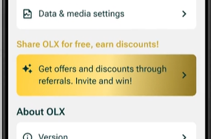
I transformed the generic ‘Invite friends to OLX’ into a rewarding referral flow by offering tangible benefits such as discounts on seller packages. This incentivizes the user to take action.
NEW Account and Settings flow
Before we wrap up — What else can be done?
Further scope of improvements
While this redesign tackled key experience gaps, with more time, resources and testing, following are some more enhancements that could be explored to further elevate the OLX experience:
- A Saas subscription based premium version of the app with no ads, exclusive packages for sellers and more features.
- Gamify the experience with exclusive memberships and statuses rewarded to users with higher engagement and conversions.
For eg: Myntra Insider
- Periodic reminders (Automated) to Sellers checking if their products are sold or available, thereby decluttering inactive listings.
- Additional services like doorstep delivery or pick-up-point options for buyers easing logistics and boosting sales.
- I did not touch on OLX’s “packages” service for sellers which can be optimized to boost seller’s conversions.
My learnings
- Design decisions should balance business impact with user satisfaction — because long-term value comes from putting users first.
- Good design finds opportunities where business goals and user needs align — including exploring alternative revenue streams that feel natural, not intrusive. Often, the most sustainable revenue models are the least disruptive ones.
- I learnt how to work with and carry forward an existing design system and improve on it to be on par with the brand’s reputation. Everything from revamping components to making new ones, analyzing inconsistencies, and exploring better possibilities.
Thats a wrap!
Hope you enjoyed this case study 🙂
Thank you for your time ❤️

